| Cost: | Difficulty:
|
Danger 1: (No Hazards) | Utility:
|
------------------------
|
The Hyperscope and Pseudoscope Aid Experiments on Three-Dimensional Vision |
||||||||||
|
--------------------- |
||||||||||
|
by Jearl Walker |
||||||||||
|
--------------------- |
||||||||||
|
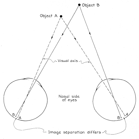
The cues about distance and depth can be grouped into five categories: convergence, retinal disparity, accommodation, motion parallax and pictorial. Convergence involves the angle between the lines of sight from each eye when you look directly at an object. Retinal disparity involves the difference in the position of an image on the two retinas. Accommodation is a change in the shape of the eye's lens in order to focus an object onto the retina. Motion parallax is the relative motion of near and far objects through your field of view when you move or the objects move. Pictorial cues involve the information about depth that can be perceived even in a flat painting. Included are lines of perspective, the blocking of one object by another, shadows and shading and the variation in the density of textures with distance. Convergence and retinal disparity play a role in most perceptions of three dimensions. They invoke the concept of the visual axis, or line of sight, which is an imaginary line connecting an object with its image on the retina when you look directly at the object. Suppose you look directly at an object A. Its image lies on the visual axis, and so on the same part of the retina in each eye, enabling the brain to fuse the two views into a single perception. The angle between the two visual axes is called the angle of convergence. It is related to the angle through which the eyes must turn in order to direct their axes at A. The visual system associates that angle with distance to the object: the larger the angle is, the closer the object seems to be. When you look directly at A, the images of a more distant object B are at different places on each retina. The visual system recognizes this disparity as a cue to the depth between A and B. The recognition can also be explained in terms of convergence angles. If you look directly at B, the angle between the visual axes is smaller than it was for A. Therefore B must be farther away than A.
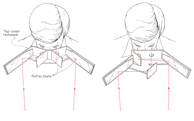
Retinal disparity depends partly on the separation between the two eyes, which is about six centimeters. Pope set out to explore what happens to perception if the separation is changed. One of his instruments, the hyperscope, effectively increases the separation to about 20 centimeters by means of reflections from mirrors. Similar instruments were studied by Charles Wheatstone and David Brewster in the 19th century. The increase in the effective distance between the eyes increases the retinal disparity of images formed on 9 the retinas and the difference in convergence angles when you look from one object to another at a different distance. Suppose you look at A through the hyperscope while B is also in view. The new disparity of separation between the images of the two objects 9 on the retinas forces you to perceive greater depth between them. You also perceive greater depth because the difference in convergence angles for the objects is now greater. The hyperscope also alters the apparent height and width of nearby objects. In normal vision you are accustomed to a certain relation between the size of an object's image on the retina and the object's distance, as implied by the convergence of the eyes when you look at it. Seen through the hyperscope, an object looks smaller because the angle of convergence required to see it through the mirrors is larger than normal.
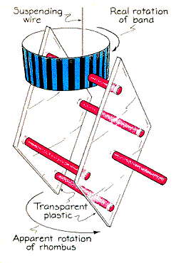
Many other familiar objects take on a strange appearance through the hyperscope. For example, a person's face looks thinner and seems to have a prominent nose. All the objects immediately return to their normal appearance if you close one eye while still looking through the instrument with the other one. Because you are no longer able to compare retinal disparity or convergence angles between the eyes, you are left with only the pictorial cues about depth. Another of Pope's instruments, the pseudoscope, makes use of mirrors to switch what the eyes are seeing. The exchange reverses the cues about distance from retinal disparity, sometimes causing a distant object to seem closer than a nearer one. The exchange of depth is most vivid for me when I look through the pseudoscope at complex arrays such as trees or brush. Branches at the rear of a tree seem closer than branches at the front. The sight is eerie because I realize that the front branches partially block my view of the rear branches. Depth is also inverted when I look at an object that can easily be reversed mentally. For example, a pot hung bottom out on the kitchen wall suddenly appears to bulge inward rather than outward. Pope has made several constructions of transparent plastic that seem to move surprisingly when a pseudoscope inverts them. One is a rhombus consisting of two plastic parallelograms held together by four metal rods. The rhombus is suspended by a thin wire. Propped on top of the rhombus is a band of alternating green and black stripes. One of the rods passes through the band to hold it in place. I suspended this device from a ceiling lamp fixture, rotated the rhombus to twist the wire, released it and then viewed it
through the pseudoscope from a distance of about five meters. Initially the rhombus and the band rotated together, first one way and then the other as the wire twisted and untwisted. Suddenly the rhombus inverted front for rear. Thereafter it and the band appeared to rotate in opposite directions. Although I knew the two objects were firmly connected, I could not shake the illusion of opposite rotation until I closed one eye. Readers interested in buying the hyperscope, the pseudoscope or a device called the duoscope that combines the two instruments should write to Pope at Scope Productions, 102 Newbury, Berkshire, U.K. RG16 9HJ. Pope can specially design large versions suitable for museums. Some printed advertisements invoke a sense of depth with adjoining regions of different colors. For example, small red letters on a blue background seem to me to be higher than the background if the illumination is bright. The illusion becomes stronger when I move the pattern farther away. As the illumination is made dimmer, the letters seem to drop to the plane of the background and then move below it. In very dim illumination the sense of depth disappears. Colors intermediate to the red and blue ends of the visible spectrum give rise to weaker sensations of depth.
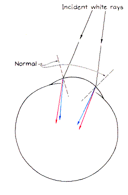
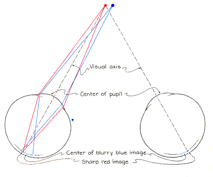
The illusion of depth in colored patterns is due to the spreading of colors by the eye (a phenomenon called chromatic dispersion or aberration) and to the fact that the center of the pupil is not on the visual axis passing through the pupil. When rays of light pass through the curved cornea of the eye, they are refracted and their component colors are spread. The refraction is measured in relation to a line (the normal) perpendicular to the surface at the point of refraction. If the incident ray is white, the refracted blue ray is closer than the refracted red ray to the normal. Intermediate colors are refracted at correspondingly intermediate angles. Because the cornea is curved, the normals to it are oriented in different directions at different points on its surface. Hence rays entering the nasal side of the cornea are refracted in directions different from those of identical rays entering the temple side. The extent of dispersion at any location depends on the angle between the incident ray and the normal there. A larger angle yields a greater dispersion. Additional dispersion arises in the lens of the eye. To demonstrate the illusion, which is called the color-stereoscopic phenomenon, paste two small circles, one blue and the other red, on a black card. I cut the circles from cards displaying pure tone colors as guides in color printing and photography. Inked circles from ordinary pens may serve, but impure colors weaken the illusion. Space the circles closely, putting the red one on the left. Hold the card in bright light and look directly at the red circle, making whatever adjustments are needed to bring it into focus. At each eye rays of light from the circle are refracted at the cornea, pass through the pupil and cross, forming a sharp image at the point where the visual axis intersects the retina. If the second circle were also red, it would form a sharp image slightly to one side of the first image. When that circle is blue, the image is blurry. The blue rays are additionally refracted, and so they cross in front of the retina. By the time they reach the retina they are spreading. That is the reason they produce a blurry image. For two reasons the center of the blurry blue image does not fall on the sharp image. First, in bright illumination the pupil is small and its center is on the temple side of the visual axis.
Light rays can enter the eye farther off the axis on that side than on the other side, thereby putting more of the blurry image on the nasal side of the axis. Second, additional bias in the position of the blurry image results from the skewed pathway of the visual axis through the lens of the eye. The line of symmetry through the lens lies on the temple side and at an angle of about five degrees to the visual axis. Light passing through the temple side of the lens is dispersed more than light that h passes through the nasal side. The arrangement of the blue image on the nasal side of the red image creates the illusion that the blue circle is farther away than the red one. The apparent depth is not altered if you switch your gaze and focus it sharply on the blue circle. In each eye the blue image then lies on the point where the visual axis intercepts the retina. The red rays, which are less strongly refracted, tend to focus behind the retina. When they reach the retina, they form a blurry image. The center of this image lies on the temple side of the blue image. Again the blue circle seems to be farther away because the blue image still lies on the nasal side of the red image.
The relative positions of the colored images change in decreasing illumination because each pupil then widens eccentrically and the center of the pupil shifts toward the nasal side of the eye. When the center of the pupil reaches the visual axis, the center of the blurry image almost coincides with the sharp image. The circles seem to be equidistant from the viewer. With a further decrease in illumination each pupil widens more and its center moves off the visual axis toward the nasal side of the eye. This migration moves the blue image across the retina toward the temple side of the red one. The visual system's perception of depth is then reversed from what it was initially. Many observers cannot discern any depth in arrangements of this kind, whereas others see the letters consistently above or below the background even when the illumination level is varied. I suspect that in the first group the observer's knowledge that the circles are equidistant overrides the illusion. In the group that does perceive a disparity the center of the pupil may stay on one side of the visual axis or the other regardless of the change in the pupil's width.
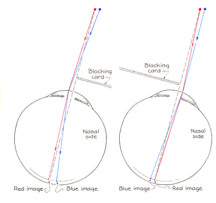
In 1965 B. N. Kishto, a resident of the Indian Ocean island of Mauritius, described in Vision Research ways to demonstrate chromatic dispersion by illuminating only one side of each eye. To repeat one of his demonstrations I block the nasal half of each eye's field of view with a card as I look at the colored circles. The light entering the eye on the uncovered temple side is refracted. Blue light is directed more than red toward the normal at the corneal surface. Dispersion is enhanced by the lens of the eye. The blue image ends up on the nasal side of the red image. The blue circle looks farther away than the red one. Next I block the temple half of each eye's field of view. Although blue is still refracted more than red, the new orientation of the normal changes the relative locations of the images. The blue image is now on the temple side of the red image, and as a result the blue circle now appears to be closer than the red one. The same results can be obtained with a pinhole. Make a hole about two millimeters in diameter in an index card. Look at the colored circle with one eye closed and the pinhole in front of the other eye. The blue circle seems farther away than the red one when you position the pinhole on the temple side of the open eye. The apparent depth is reversed when the pinhole is on the nasal side. The pinhole creates another illusion. Look through the pinhole and move it toward the temple and nasal sides of your view as far as you can without losing sight of the circles. The lateral (left-right) separation between the circles changes, being smallest when the pinhole is at its extreme nasal position and largest when it is at its extreme temple position. The increase in dispersion on the temple side results from the skewed alignment of the visual axis with the line of symmetry passing through the lens.
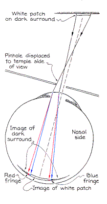
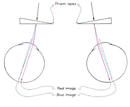
Kishto also showed how the dispersion of light can produce colored fringes on a small white patch with a dark surround when the patch is viewed through a pinhole. To test this result I pasted a small white rectangle on a black card. When I hold the pinhole on the temple side of an eye, that side of the white patch is fringed with blue and the nasal side with red. When I move the pinhole to the nasal side of the eye, the colors reverse. White light from the patch is dispersed into colors when it enters the eye. In the center of the retina, however, the color from one point of the patch overlaps colors from other points to re-create a perception of white. You therefore see color only along the left and right edges of the rectangular patch. In several other experiments Kishto described, observers viewed equidistant colored patches through narrow glass prisms in order to increase the dispersion of light. When the apexes of the prisms pointed toward the temple side of each eye, an observer had to decrease the convergence of his eyes to see the patches. In this situation a red patch seemed closer than a blue one. The situation was reversed when the apexes pointed toward the nasal side of each eye.
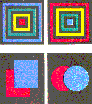
The illusion of depth worked best when the patches occupied about one degree in the field of view and were separated by about a quarter of a degree to half a degree. In some trials an observer viewed an array of four patches of different colors. With certain color arrays the inner corners of the patches seemed to curl up or down in relation to the plane of the outer corners. The illusion of depth is weaker at the more distant outer corners. Joseph Hodych of the Memorial University of Newfoundland has suggested that contour maps of magnetic fields in the ground be coded in colors and then viewed through a large magnifying lens so that the relative strength of the fields is represented by the perceived depths of the colors. The lens is in effect Kishto's first arrangement of two prisms. In another set of experiments observers viewed arrangements of colored and black strips designed to give pictorial cues about depth. In one case the order of the colored regions from the central square outward was red, yellow, green and blue. When this pattern was viewed with both eyes looking through prisms whose apexes were directed toward each other or with one eye looking through a pinhole on the nasal side of the eye, it resembled a hallway. When the experimenter reversed the order of the colors, the pattern looked like a bellows projecting toward the observer. If the pattern is colorless, its depth cues are ambiguous. I can see it as either a hallway or a projection toward me. With the extra sense of depth generated by the colors I become locked into one of those perceptions. With another pattern [see bottom illustration at left] the pictorial cue that one object is blocking my view of a more distant object is so strong that the color-stereoscopic phenomenon cannot change my perception of depth in the pattern. You might enjoy investigating other patterns where pictorial cues enhance or oppose the illusion of depth created by adjacent colors.
Bibliography THE COLOUR STEREOSCOPIC EFFECT. B. N. Kishto in Vision Research, Vol. 5, pages 313-329; June, 1965. THE EFFECT OF PUPIL SIZE VARIATIONS ON THE COLOUR STEREOSCOPIC PHENOMENON. Jon Martin Sundet in Vision Research, Vol.12, pages 1027-1032; May, 1972. BREWSTER AND WHEATSTONE ON VlSION. Edited by Nicholas J. Wade. Academic Press, 1983.
Suppliers and Organizations The Society for Amateur Scientists (SAS) is a nonprofit research and educational organization dedicated to helping people enrich their lives by following their passion to take part in scientific adventures of all kinds. The Society for Amateur Scientists |